Using data and measuring change tools
Measurement is an essential part of quality improvement. The way we capture and process data of improvement efforts can radically affect your understanding of whether your change resulted in improvement and in what way. This page provides an introduction on measurement for improvement relevant for paediatrics.
The value of measurement
Central to quality improvement is our commitment and ability to know whether changes made have led to an improvement and then whether that improvement has been sustained. This requires data at three stages of your improvement and for three subtly different purposes:
- Context or baseline data – how do you know that the extent and nature of the problem?
- Improvement data – how will you know if there has been an improvement and whether specific changes caused that improvement?
- Sustainability data – how do you know whether an improvement has been sustained?
Depending on the nature of the improvement you are addressing – from simple processes; complicated changes to linear pathways; complex systems including behaviours and human factors; to chaotic, highly complex systems – your data collection system may vary. In most cases, there is value in collecting both qualitative and quantitative data. Without both numbers and narrative, you will struggle to demonstrate the learning from your QI work. However, it is important to be practical and pragmatic: data collection does not need to be exhaustive over overly burdensome.
With process or pathway improvement, data collection can usually be focused on a single measure or a small number of measures at baseline, during improvement and after improvement. Capturing multiple data points over time for these measures can enable you to easily see variation in process and demonstrate with statistical significance.
Principles of time-series data
Understanding variation captured in Run charts and Statistical Processing Control charts can be a challenging aspect of improvement. These trusted resources can help teams measure change, spot what’s working (or not), and drive better outcomes.
Time-series measurement: Time-series measurement in quality improvement means collecting data at regular intervals to track trends and assess change. Unlike audits or RAG ratings, which give a single snapshot, or point-to-point comparisons that only show the difference from the last measure, time-series data reveals patterns over time. This helps teams separate real improvement from normal variation.
- Normal variation: The usual ups and downs you’d expect in a process, even when nothing has changed.
- Special cause variation: A change in data (for better or worse) that stands out because something different happened because of your intervention or a separate external factor (e.g. staff sickness, the weather).
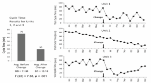
Perla, Provost and Murrey (2011) provide a clear and simple overview of why time-series data can be provide a deeper insight that pre-post data. The data presented in the three charts below all produce the same pre-post table on the left. However, the change in Unit 2 shows no effect and the change in Unit 3 appears to only have had a temporary effect.
Key tools: Run charts
Run charts are a simpler form of time-series visualisation with a median line, with interpretation using simple rules (e.g. from IHI). They are quick and easy to make, and are ideal for early improvement projects , but as they are not based on formal probability limits they are less statistically robust than SPC charts.
- Video and template: The Institute for Healthcare Improvement (IHI) provides instructional videos about using Run charts as well an Excel template that creates a Run chart as you enter your data. Institute for Healthcare Improvement (IHI)’s Run chart resources
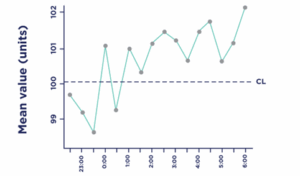
Key tools: Statistical Process Control (SPC) charts
SPC charts plot data over time with statistically calculated control limits. They not only show whether variation is normal or not, but the degree of the variation, using statistically calculated limits. While conceptually more complex, templates and software calculate limits automatically, making it easier in practice and more reliable
- Video: This short video introduces the SPC tool and its role in improvement, including why time-series analysis matters, how variation works, and how you can use the SPC tool in practice. More at the NHS England Statistics Process tool website
- Template: The NHS England SPC Tool is a ready-to-use Excel template that makes it straightforward to plot your data over time, apply SPC rules automatically, and annotate meaningful changes. Find the template here.
- Guide: Download NHS England’s guide Making Data Count – Strengthening Your Decisions. This 87-page handbook explains how to use SPC charts in healthcare, from basics to advanced topics like process limits, seasonality, and benchmarking, with real NHS examples. It covers interpreting charts, recalculating limits, and making data meaningful for board-level discussions—helping teams avoid overreacting to random variation or missing real change. Ideal for service-improvement leads, analysts, and clinical managers.